Case study, 02 of 05
Static Coffee
Small-batch DTC roaster, Jacksonville FL. One cafe on King Street.
Small-batch DTC roaster, Jacksonville FL. One cafe on King Street.
Static Coffee Co. is a rebrand for a small-batch DTC roaster with one cafe on King Street in Jacksonville, built for specialty coffee people who think a tasting note is a personality disorder. The mark is a mascot, not a logo: a jittery coffee cup mid-jolt, static-shock hair standing straight up instead of steam curls, built like a real die-cut sticker so it reads as something you would actually peel and slap on a laptop.
The palette runs near-black plus one screaming electric yellow-green, committed all the way through instead of split across five muted tones. The mascot carries the whole risk. Everything around it, the mono labels, the flat ink ground, the two-color rule, stays quiet on purpose so the one loud thing lands.
Grounded in Liquid Death (the two-color discipline and a wordmark treated like merch, not a logo), Dark Matter Coffee (the illustrated mascot standing in for a mark), and skate-flyer asymmetry (the diagonal stamp and the torn-poster layout, nothing centered).
The mascot carries the entire risk. Everything else stays quiet on purpose so it lands.
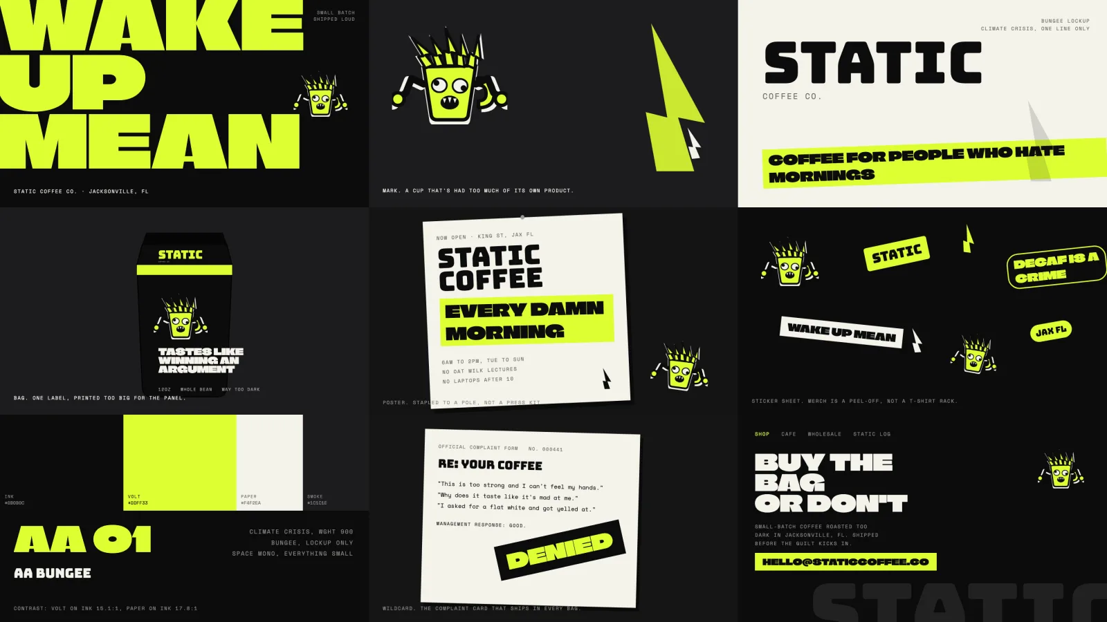
 Website
 Bag
 Poster
 Stickers
 Complaint form
 Facebook feed
 Instagram feed
 TikTok and Reels
Two colors, committed all the way through, instead of five muted tones nobody remembers.