Case study, 03 of 05
Chase
Retail bank. Unsolicited concept rebrand.
Concept work. Unsolicited. Not affiliated with or endorsed by JPMorgan Chase & Co.
Retail bank. Unsolicited concept rebrand.
Concept work. Unsolicited. Not affiliated with or endorsed by JPMorgan Chase & Co.
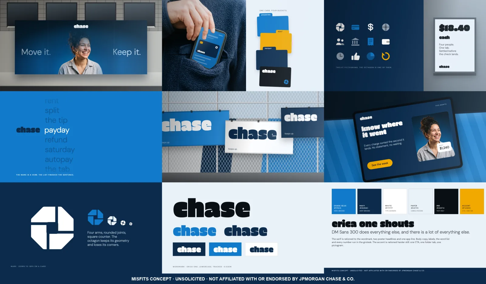
chase is an unsolicited concept rebrand of a retail bank, built by Misfits as a portfolio piece. Nothing in the package is a real Chase asset, product, rate or policy. The palette is the bank's own, measured off chase.com with a script rather than guessed, then moved one stop brighter and one stop cooler. A color picked to survive as a link on a white page has nothing left over when it has to carry a billboard.
The name already contains a verb, so the word list turns the logo into the first half of a sentence the customer finishes. chase rent, chase payday, chase whatever is actually keeping them up. That panel is the reason the name was worth keeping. The octagon survives as a pinwheel pictogram with a square counter and is demoted on purpose: one of twelve icons, the same size as the wallet and the clock, never a badge and never centered.
Grounded in the 'until' fintech concept by Afrian Hanafi, taken for its structure rather than its color: one ground per panel, and environmental placement instead of a logo on a white square. Also grounded in Oatly, whose packaging runs a conversation in the display face at a scale that ignores where copy is supposed to go, and in 1970s American savings-bank signage, which is where the fat soft serif comes from.
A bank that keeps its own blue and stops apologising for it. The word rent at 96px on a chain-link fence, and a 150px soft serif on a category that buys geometric sans for safety.
 Billboard
 Word list
 Fence banners
 Card and app
 App
 Facebook feed
 Instagram feed
 TikTok and Reels
The bank's own family, measured off its live site and moved one stop for walls. The accent appears three times in the whole package and never a fourth.