Case study, 05 of 05
Weaver
Family dental practice, Northside Jacksonville FL.
Concept work. Unsolicited. Not affiliated with Weaver Family Dentistry.
Family dental practice, Northside Jacksonville FL.
Concept work. Unsolicited. Not affiliated with Weaver Family Dentistry.
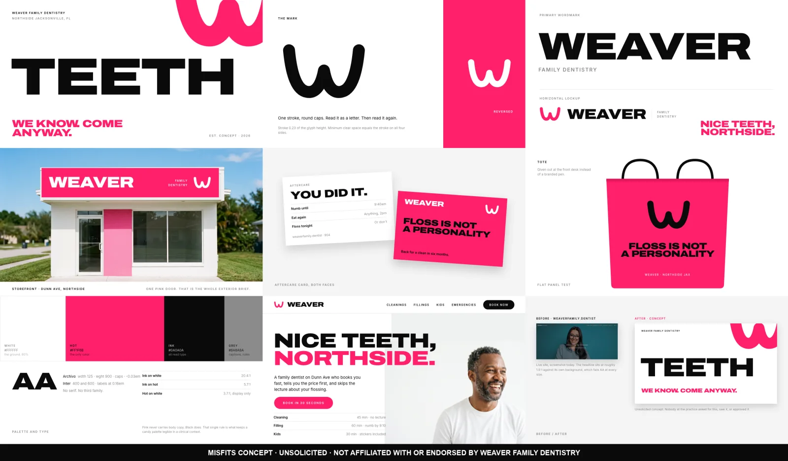
Weaver Family Dentistry is an unsolicited concept rebrand of a real family practice on the Northside of Jacksonville, treated like a consumer brand people talk about rather than a clinic people avoid. Nobody at the practice asked for this, saw it, or approved it. The problem is measurable rather than a matter of taste: 48 Google reviews at 4.3 against 365 for the practice two blocks away, and a stock WordPress dental theme whose hero headline sits at roughly 1.9:1 against its own background. That headline fails AA at every size, on load, on the one screen that has to work.
The system is pure white, one saturated candy pink, and jet black type set large. Pink was chosen over the coral-red the direction also allowed because in a dental context a hot red reads as blood and a soft pink reads as gums, while a magenta-leaning pink at full saturation reads as candy and as nothing anatomical. One rule keeps it legible: black carries every word that has to be read, and pink never carries body copy. The mark is a W built from a single thick stroke with round caps, drawn so it reads as a letter first and a mouth second. That is the only place a smile appears anywhere in the identity.
Grounded in Hers, pulled from Mobbin and measured, for a health brand that behaves like a lifestyle brand: white ground, headline at display scale with the second line carrying the only color on the screen, a solid pill CTA, small wide-set nav labels. Also grounded in Glossier for copy that talks to you like it already likes you, and in MSCHF for the spec-sheet caption, which became the whole service page. Cleaning. 45 min. No lecture.
The hero for a family dental practice is the word TEETH in jet black across a white panel, with the pink mark cropped by the frame and nothing else on it. No smile, no face, no tooth, no reassurance.
 Hero
 Storefront
 Treatment room
 Website
 Aftercare card
 Facebook feed
 Instagram feed
 TikTok and Reels
One color on white, held by one measured rule. Black on white is 20.4:1 and black on pink is 5.7:1, so black carries every word. Pink on white is 3.7:1, so pink is display scale only.